GS25, The convenience store, reimagined as a lifestyle platform

Year
2018
Client
GS Retail
Timeframe
1 year
As
Lippincott Team
BRIEF
SOLUTION
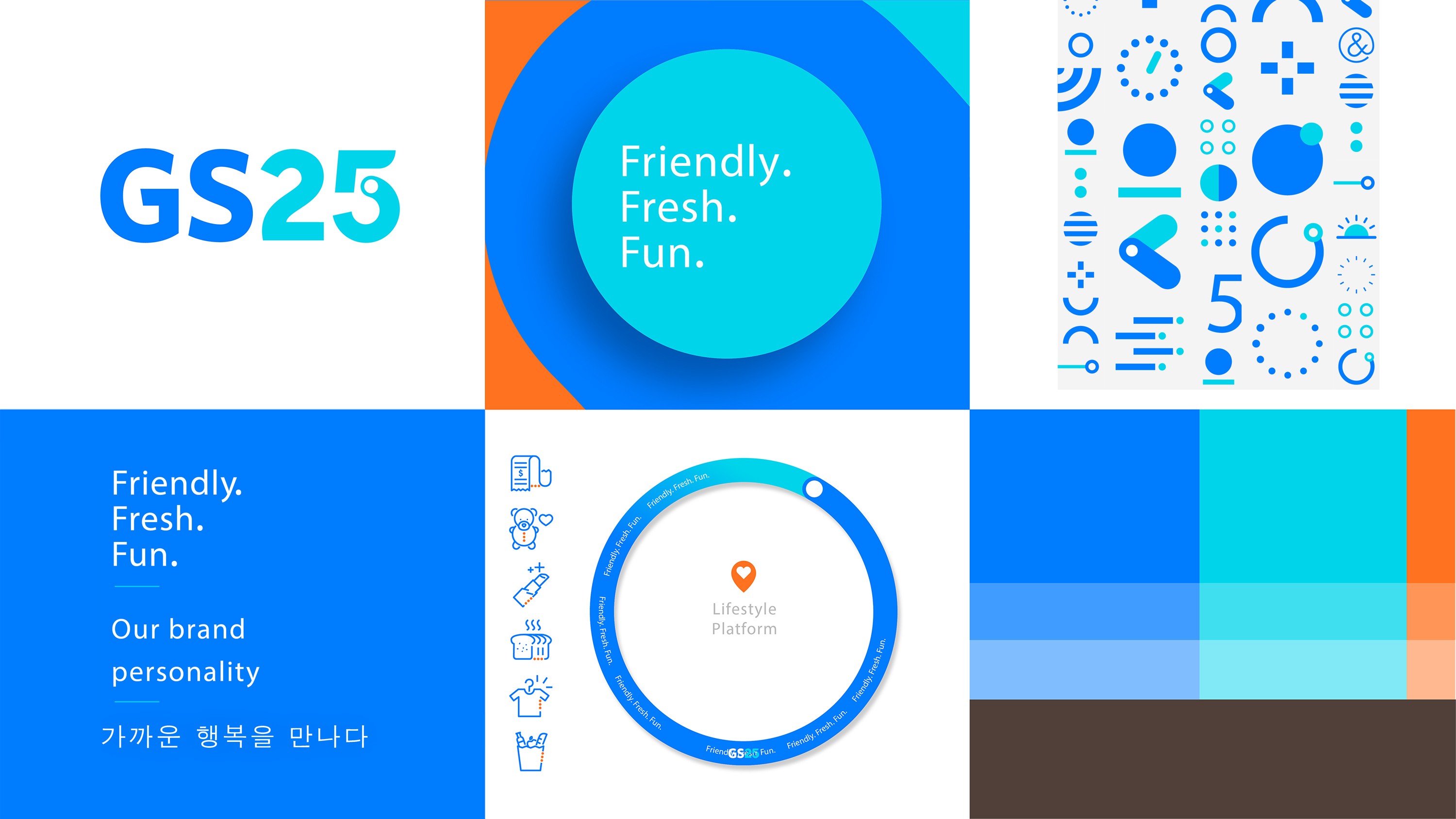
The work began with research — trend analysis, focus group interviews, internal sales data, customer surveys, and employee interviews — to understand how GS25 was perceived and where it stood against competitors. A key FGD finding: blue was already the colour customers most associated with the brand, despite being only weakly expressed in the existing logo. That latent association became the anchor for a visual direction that amplified and refined blue into something more confident and contemporary. Research also revealed that each convenience store chain held a distinct personality in customers' minds, shaped by its products and services. GS25's persona was defined and used as the foundation for a new logo, design system, and full suite of applications — including store fascia and interiors.
The most demanding design challenge was the signage: in Korea's heavily sign-contested streetscape, the new facade needed to command attention without adding to the visual noise, and had to hold up across the full range of store sizes in GS25's nationwide network.
The rebrand was recognised with the iF Design Award 2021 in the Communication — Corporate Identity/Branding category, amongst approximately 10,000 entries from 52 countries.


MY ROLE
Completed as Brand Strategist/Designer at Lippincott Seoul.
Brand strategy: customer research including FGDs and trend analysis, brand positioning as Lifestyle Platform, and persona development
Brand strategy oversight: ensuring every creative output stayed anchored to the strategic direction
Spatial identity direction
Discover other projects
Dive into our diverse collection of innovative projects, where creativity meets cutting-edge technology to solve real-world challenges
" height="24px" id="HYnq2L1wU" width="48.00000022171457px"/></svg>)