A national icon, redrawn for the next chapter

Year
2025
Client
Korean Air
Timeframe
4 years
As
Lippincott Team
BRIEF
SOLUTION
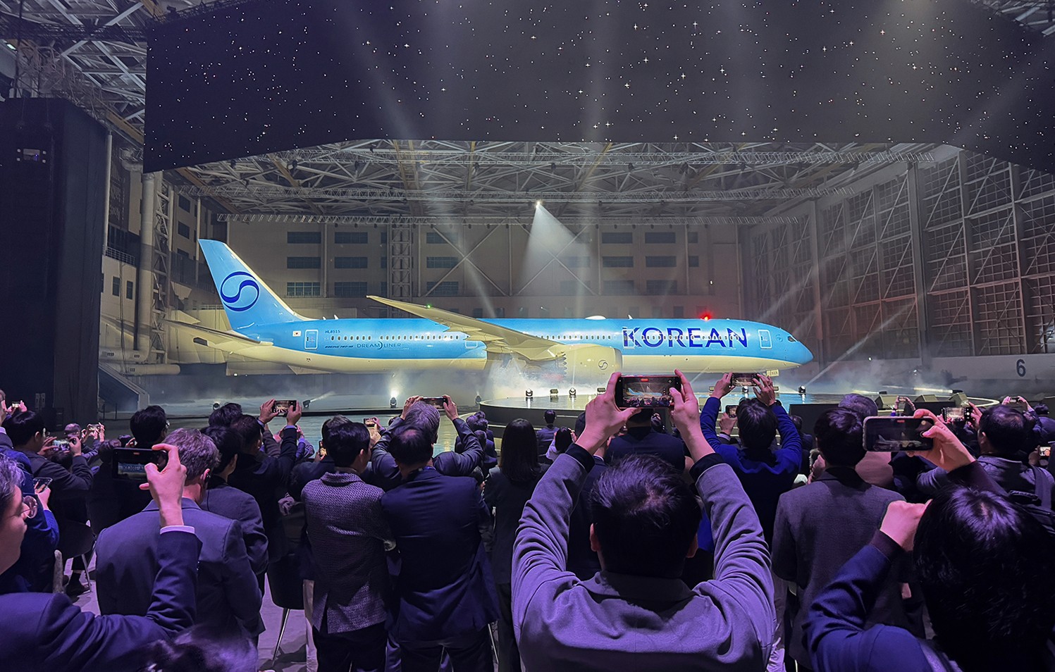
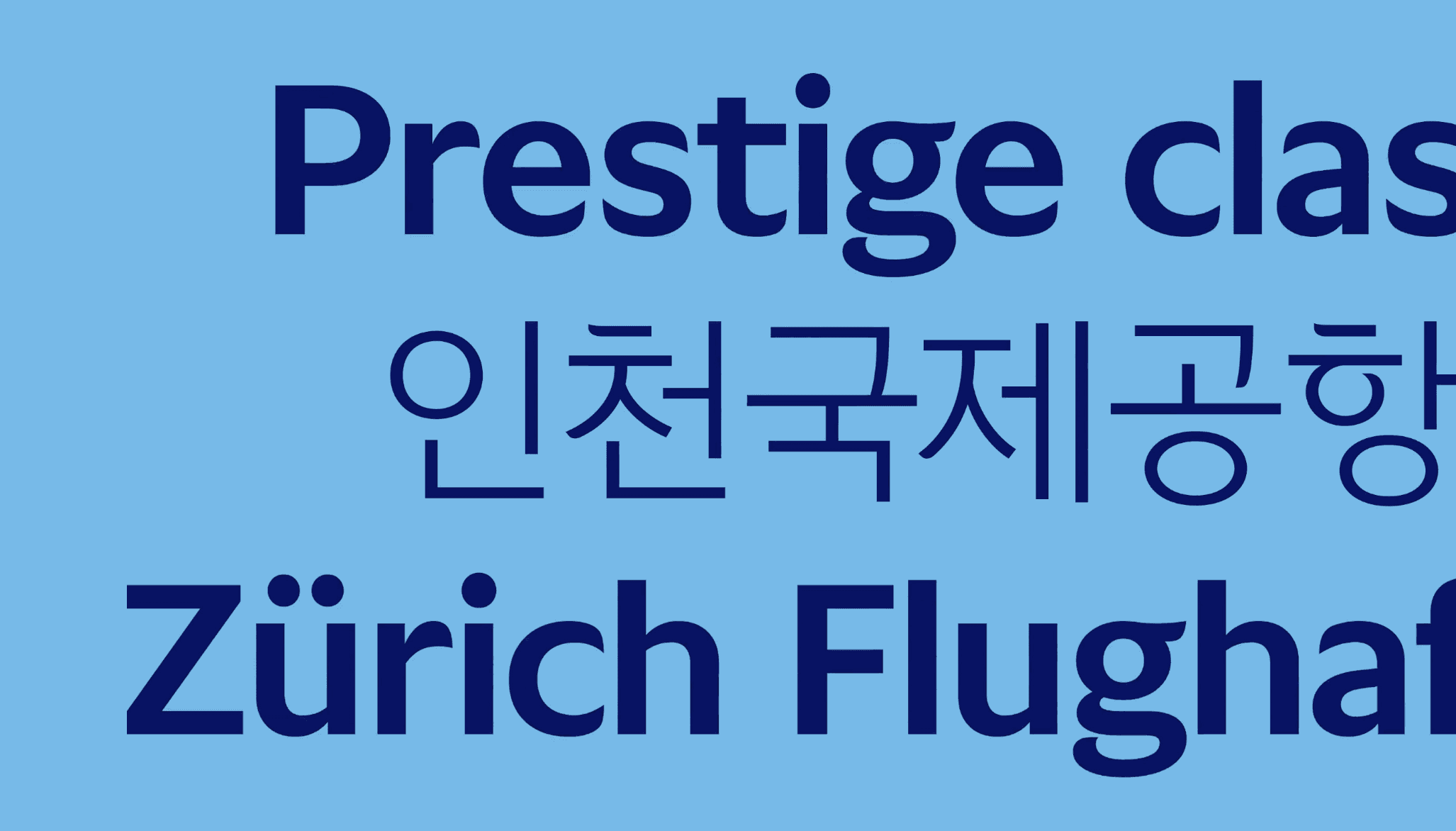
The answer lived in refinement, not replacement. The Taegeuk was redrawn - simplified to a single Korean Air Dark Blue, its curves channeling the flowing energy of Sangmo Nori. The logotype "KOREAN AIR" introduced brush-stroke-inspired letterforms that render Korean elegance in a contemporary register. For the livery, the signature light blue was preserved but pushed further: a custom metallic paint was developed specifically for Korean Air, giving the aircraft a premium presence that shifts with light. The result honours 41 years of iconic design while projecting a brand ready for the next 50.


MY ROLE
Completed as Brand Strategist/Designer at Lippincott Seoul
Visual benchmarking and cultural research
Development of modern Korean visual references
Aircraft livery colour evaluation and documentation
On-site coordination between global design teams and client teams
On-site inspection of livery masking across aircraft sizes
Discover other projects
Dive into our diverse collection of innovative projects, where creativity meets cutting-edge technology to solve real-world challenges
" height="24px" id="HYnq2L1wU" width="48.00000022171457px"/></svg>)